Accessibility in
visual communication
A lack of consistent standards?
In the digital sphere, the Web Content Accessibility Guidelines (WCAG) ensure that websites and digital applications are accessible and meet the needs of all users. However, it is not possible to provide uniform, general guidance on accessible visual design. For example, it is difficult for people with colour blindness to distinguish between colours with low contrast. When designing for people with dyslexia, on the other hand, it is particularly important to choose a clear, legible font. It therefore depends on the project and the target audience which aspects of the design require particular attention.
3 tips for accessible design
The following 3 tips can help ensure accessible design:
Provide clear navigation
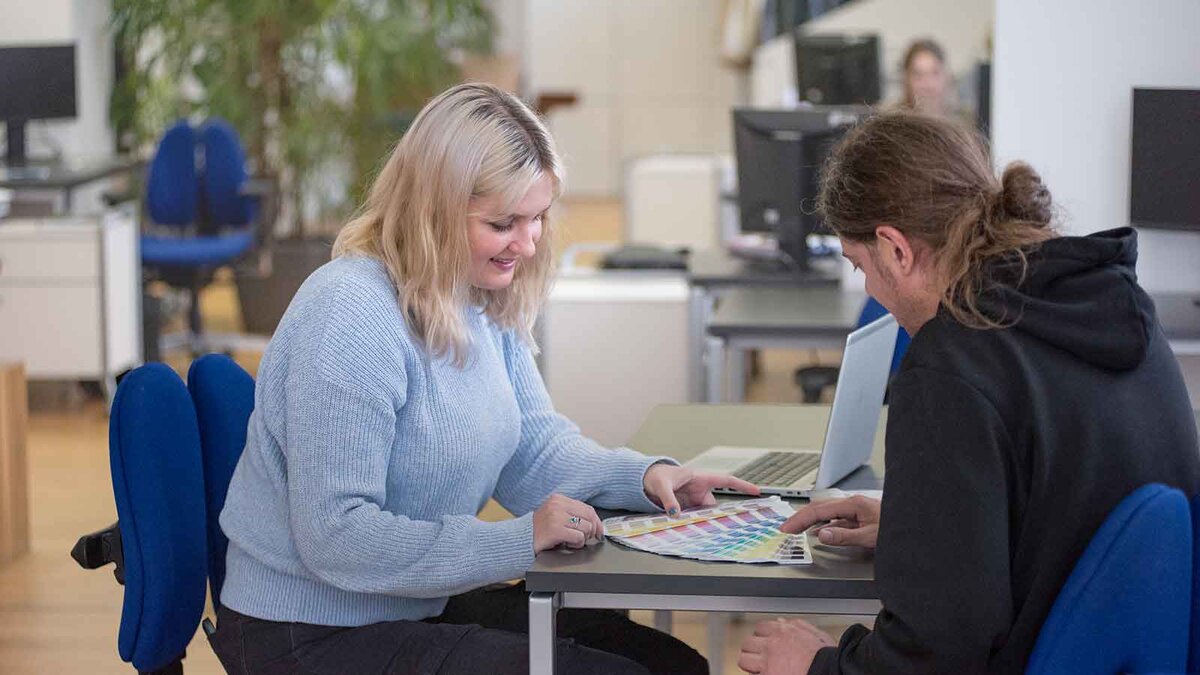
Designers can use grids: many already use grids intuitively to arrange text and images. This ensures a clear layout and sufficient space between elements.
The use of clear and consistent symbols and icons also makes navigation easier for users who may have difficulty perceiving small or complex elements.
It is also important to focus on the essentials: what can be omitted to keep the design uncluttered? Different sizes and a clear layout help to make the sequence of information clear.
Aim for accessible typographic design
Here, a clear and easily legible typeface with simple characters is essential. Decorative typefaces, such as script fonts or those with complex designs, should be avoided. Arial and Calibri, for example, are very familiar typefaces with simple character structures
There are even fonts that have been developed specifically for people with dyslexia, such as Lexend from Google Fonts or OpenDyslexic by Abelardo Gonzalez, both of which are free and freely available.
As a general rule, appropriate spacing between individual characters, words, and also lines and paragraphs improves the readability of the text – even for people without visual impairments.
The font size also plays a role. There are no set guidelines for the ideal size, as different sizes can work to varying degrees of effectiveness depending on the format, purpose and typeface. Here, designers must trust their judgement and, in the case of print products, may need to produce test prints.
Consider the use of colour in designs
If the text is coloured or set against a coloured background, a high contrast between the colours used is crucial. This is because people with visual impairments may perceive colours differently or not at all. For text, black on white offers the best and clearest contrast. Red on blue, on the other hand, can severely impair readability, depending on the colour value and brightness.
It is often difficult to assess the accessibility of a contrast with the naked eye. Various free tools are available to check for sufficient contrast, such as the contrast calculator from leserlich.info. The contrast calculator can also help to optimise images, illustrations and graphics to ensure they are accessible; particularly if these are important for conveying information. Similar colours with low contrast should not be placed next to one another here.
Conclusion: Does accessibility compromise aesthetics?
Compliance with accessibility guidelines and recommendations imposes certain limitations on design. This means, for example, that an eye-catching headline font or a specific colour scheme may not be used, even though they appear visually perfect to the designer. Designers should therefore always apply accessible design with the target audience in mind. Particularly in public spaces or when catering to diverse population groups, it is advisable to make content accessible to everyone through graphic design. This not only promotes inclusion but also broadens the reach of the message or product, as it is accessible to a diverse target audience.
In the digital sphere, practical solutions already exist: some websites offer the option to display a high-contrast version instead of the standard view. In this version, for example, black text is displayed on a white background, or decorative elements are removed to improve readability.
More detailed tips and information on practical design:
www.netz-barrierefrei.de
www.bundesfachstelle-barrierefreiheit.de

“Accessibility broadens reach. This is because no one is excluded from using a product or medium on the basis of their individual abilities. In this way, designers create a positive experience for all users.”
Viola Neuhauser
+49-911-530 63-223
vne@kaltwasser.de