2025 marks an exciting change for the sustainability organisation Bluepingu e.V.: a brand-new logo! We at Kaltwasser Kommunikation worked with the organisation to give it a fresh new look – modern, clear and in keeping with its development.
What is Bluepingu?
Since 2009, Bluepingu e.V. has been actively shaping public spaces in Nuremberg and Fürth and driving social and environmental change. The association promotes a sustainable way of life through the shared use of resources in the form of cargo bikes for everyone, education and waste prevention, and urban quality of life. With projects such as neighbourhood gardens, raised beds in public spaces, mobile bike workshops and a lending library, Bluepingu creates green meeting places and spaces for participation without the pressure to consume. Working on a voluntary basis and through a network, this committed community is constantly developing new concepts for a future worth living. In 2023, we supported Bluepingu with our Christmas donation, which led to a sustainable partnership. As part of this partnership, we have now redesigned the logo.
Why a new logo?
A logo is far more than just a graphic element – it conveys a message to the outside world. The old design served Bluepingu well for a long time, but now it was time for a more contemporary look. The mission remains the same, but the logo is getting an upgrade to make it even clearer that the organisation is also constantly evolving.
What stays the same?
We deliberately chose to retain a few key elements, as they have stood the test of time and have become dear to people’s hearts:
- The penguin: The eponymous mascot stands for environmental awareness, community and drive. It remains at the heart of the new logo too.
- The globe: A central symbol of a sustainable future for the entire planet.
- The vibrant colours: various shades of blue remain key elements that express a connection to nature.
What’s new?
Our aim was not only to give the logo a fresh look, but also to imbue it with a new, deeper meaning:
- The penguin dares to look over the edge – a sign of openness, curiosity and the foresight needed to shape a sustainable future.
- It looks ahead – this stands for optimism and the firm belief that together we can achieve great things.
The lettering is clear and straight – this conveys stability and reliability, and gives the association a strong, contemporary identity.
The new logo works well on all printed materials and in the digital space. As Bluepingu operates in a wide variety of settings, it was particularly important that the logo could be scaled and adapted flexibly to meet all requirements. The new logo was developed in close collaboration with the Bluepingu team to create a design that combines both tradition and innovation.
Find out more about Bluepingu e.V. here
Support the Pingus’ projects here.

"Bluepingu is made up of passionate makers who enrich our region in many ways - so we are all the more pleased to be able to support them with the logo redesign!"
Viola Neuhauser
+49-911-530 63-223
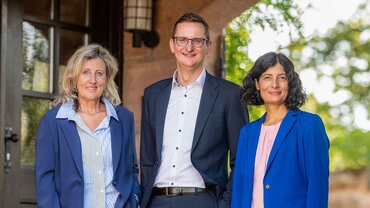
vne@kaltwasser.de